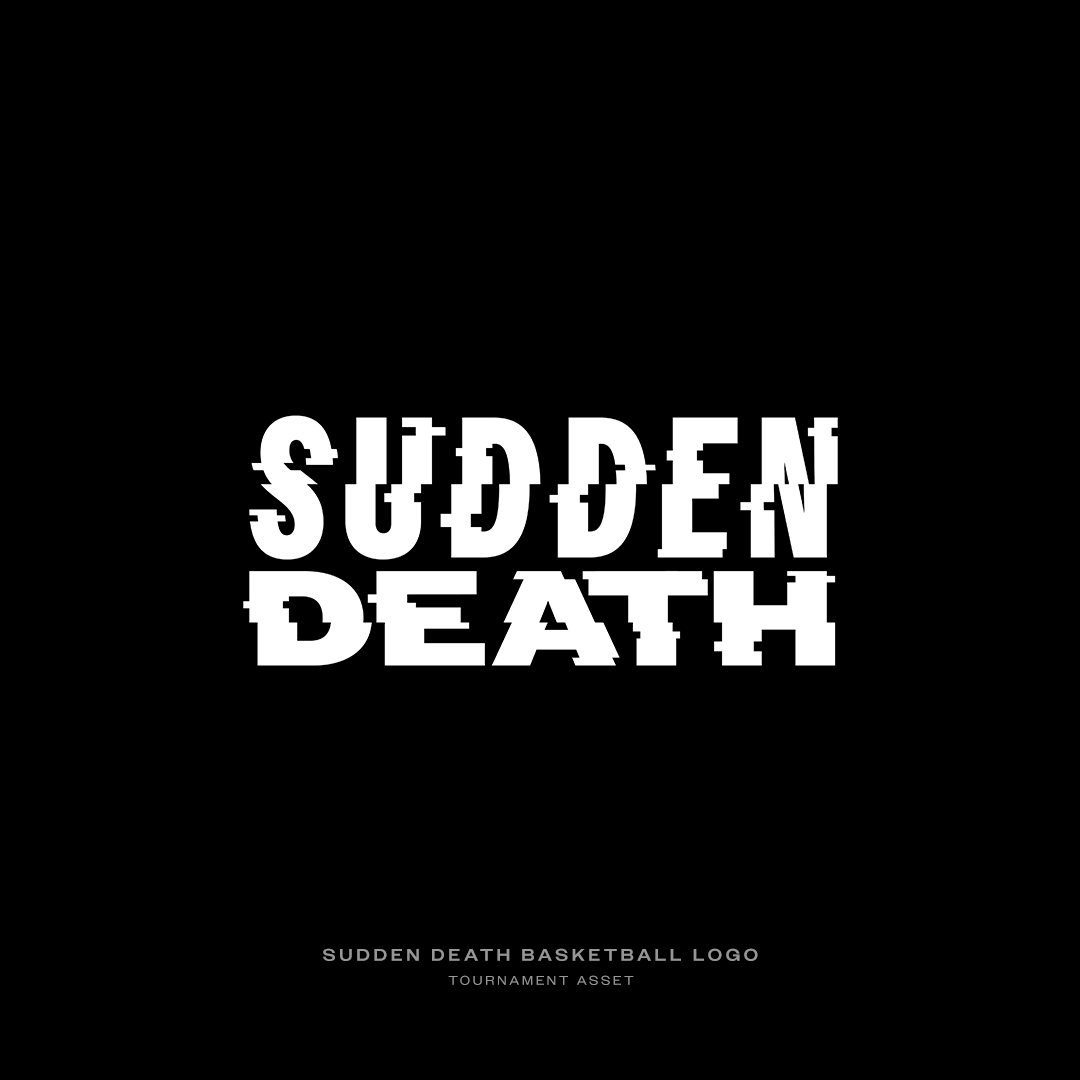
SUDDEN DEATH
ROLE: Animation | Design | Creative Direction
DATE: 2022
SOFTWARE USED: Cinema 4D | Redshift | After Effects | Illustrator | Photoshop
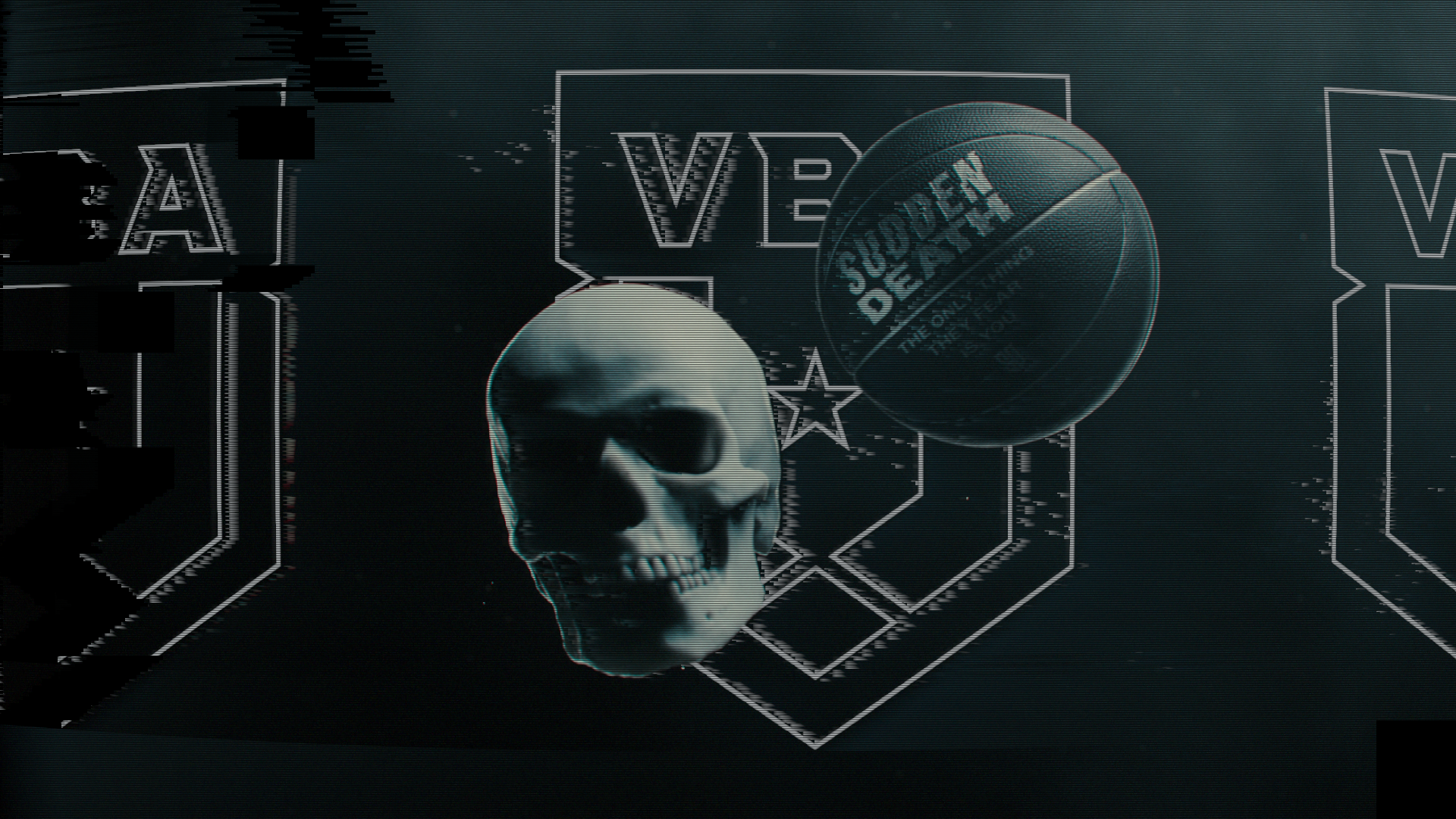
Sudden Death was my graduate project for VFS. It is a fictional basketball advertisement that immerses the viewer with a surreal take on a high stakes game of basketball.
The Graduate Project is the single largest portfolio asset generated within the Digital Design curriculum. It represents not only a larger scope than most other projects that students in the program will have worked on but also an opportunity to set a career direction and pursue an individual passion for Digital Design.
Sudden Death fills the void of tastefully art directed and engaging 3D/typographic sports visuals that I found was lacking in mainstream media. It is a combination of my love of basketball, extreme music, videogames and design. An epitome of my learning at VFS and where I stand as a motion designer up until this very point in time.


PROCESS
For this project I began with creating a Notion board to layout and understand my approach to this project. I started by clearly defining the brief and understanding what type of deliverable I would be creating for this fictional client.
I like Notion because it allows me to clearly see all of my previz work that I had created so I could easily get a feel for where I was at before going into production.
I then started with a bunch of research defining my target audience and competition. The first thing I wanted to understand was who I would be making this ad for so I could understand what important descisions I could intentionally make pertaining to the target audience. I also wanted to have a strong idea of who the brand was, and what I was creating for.
After defining my brief I moved into my animatic so I could just brain dump all my of ideas to get a start to the project. I first began with primitive shapes and just blocked out the scenes with basic camera movements. Using the viewport render I exported all of the scenes and cut them to music, also roughly placing in where my typography would go.
My process after this stage was just building up the scenes, slowly dialing in camera movements to lock off my shots so I only had to create what was inside the frame. Then I moved into bringing in highpoly assets and would just continue to make the shots stronger. Each big decision would be rendered through the viewport render and cut in After Effects so I could get a feel for the animation as a whole and could show to my classmates, teachers and mentor for feedback.
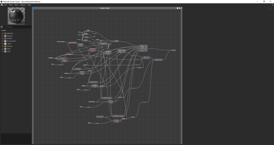
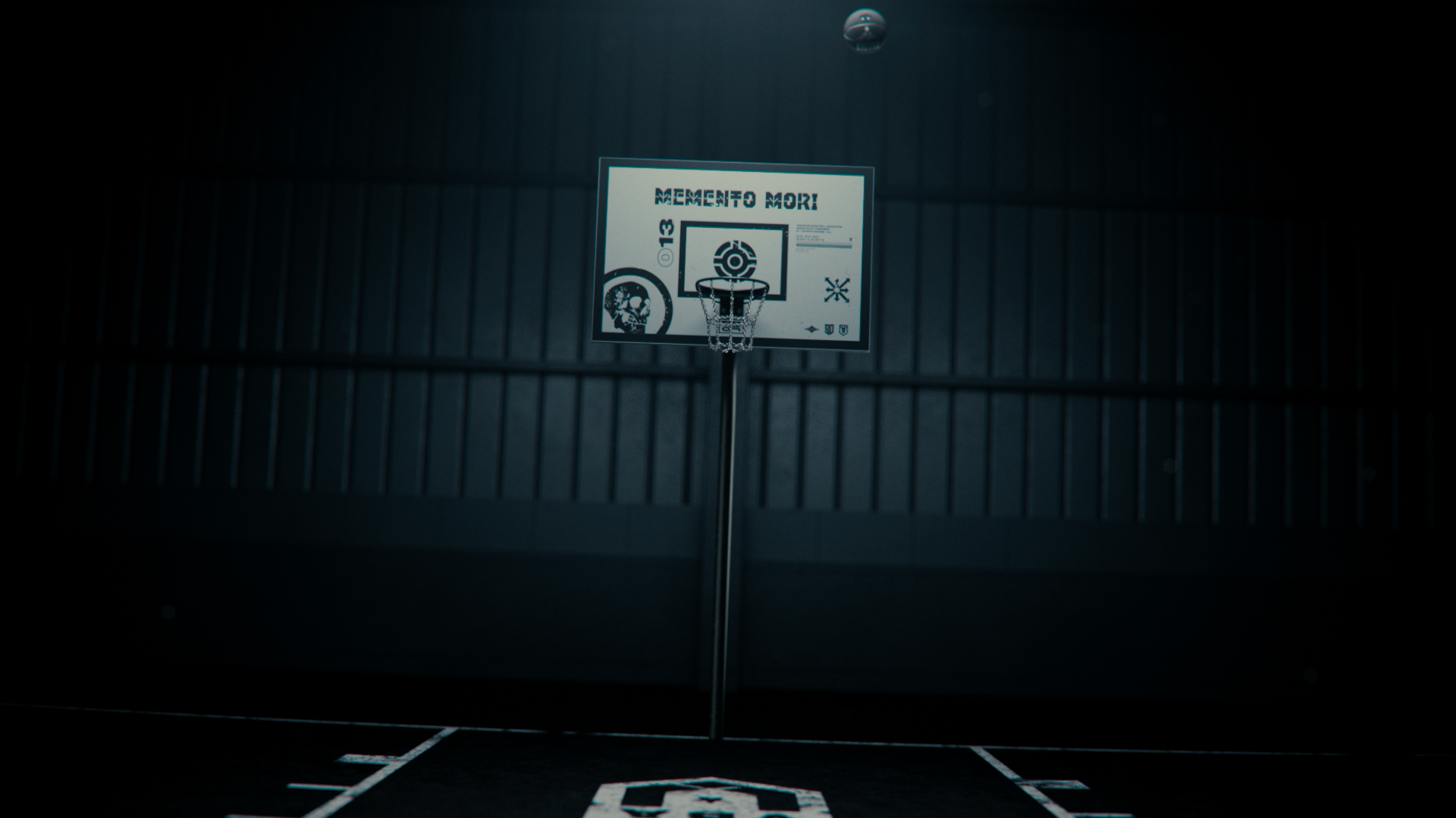
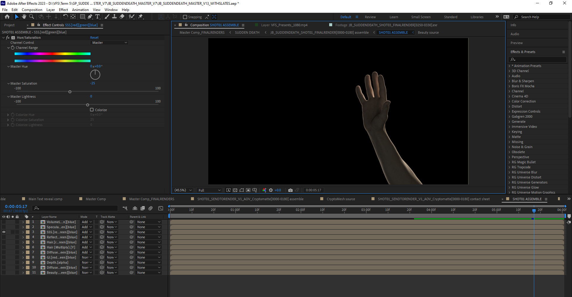
BASKETBALL TEXTURING SETUP
Early into the project I decided I would be doing the entire texturing process inside of the Redshift shader graph. This was easily the most challenging part of the entire project.
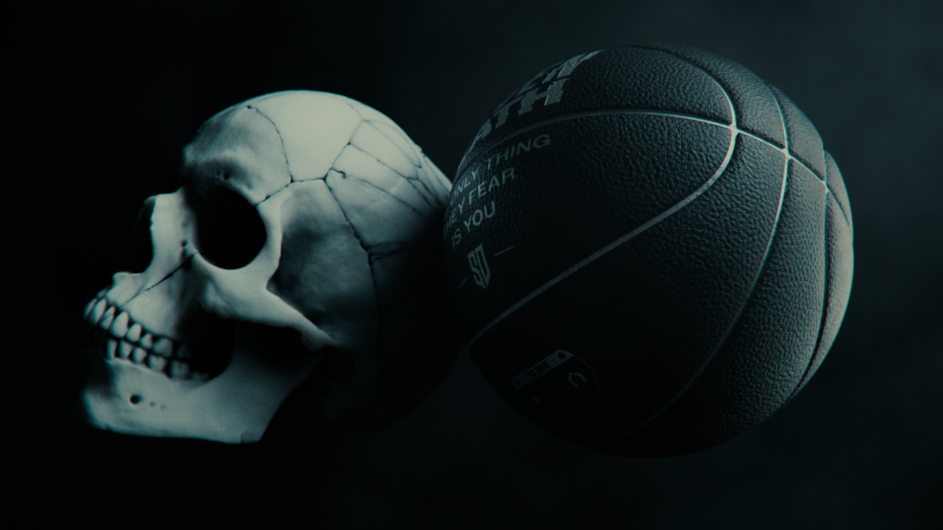
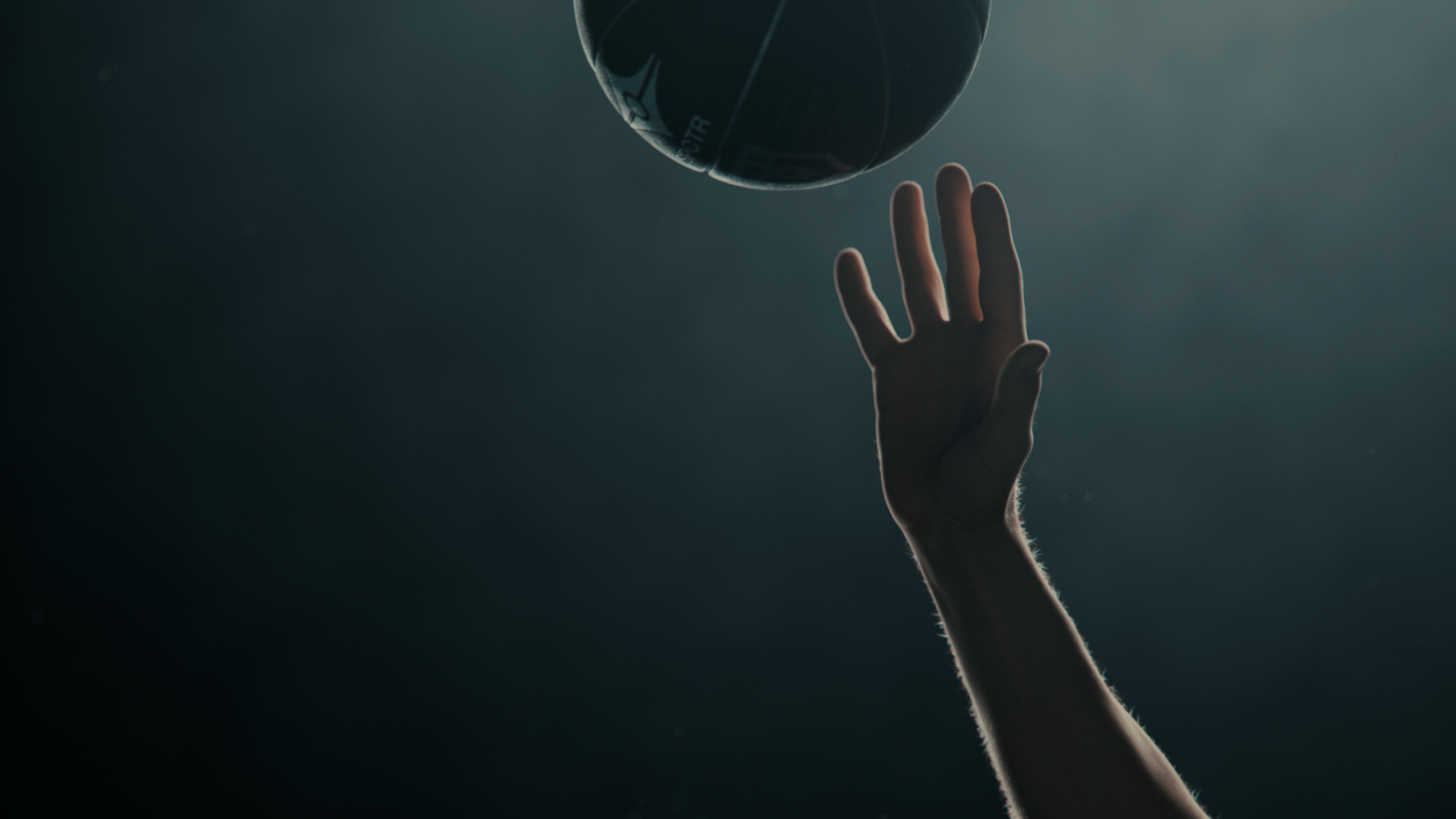
From my experience of playing basketball for almost 7 years I was quite confident in what a basketball should look like. The problem was that a lot of 3D basketballs didn’t actually look like real leather basketballs, and there was no textures from assets that would allow me to reverse engineer them the way that I wanted it to look.
So I knew that I would have to build it from scratch. The basic formula for the setup is each graphic texture uses itself as a displacement map to push the texture in creating a “stamp” effect. That stamp effect is then masked from the displacement of the little bumps on the ball because from the stamping process they would push in also.
It was a small detail but it was something I knew I would have to nail because the ball is very much so the “main character” of the entire film. And if the ball felt fake then the viewer would immediately be “taken out” of the experience.
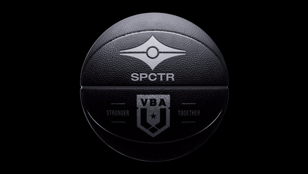
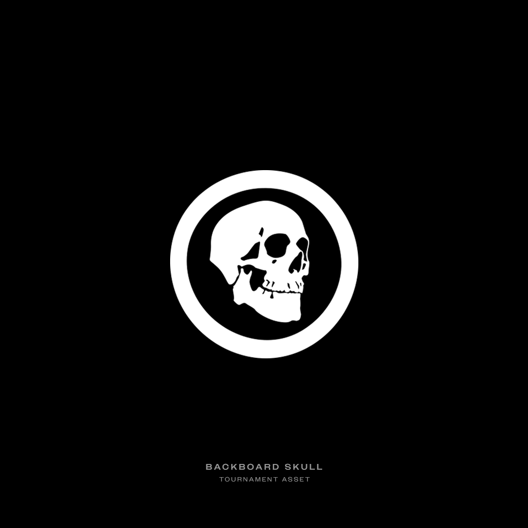
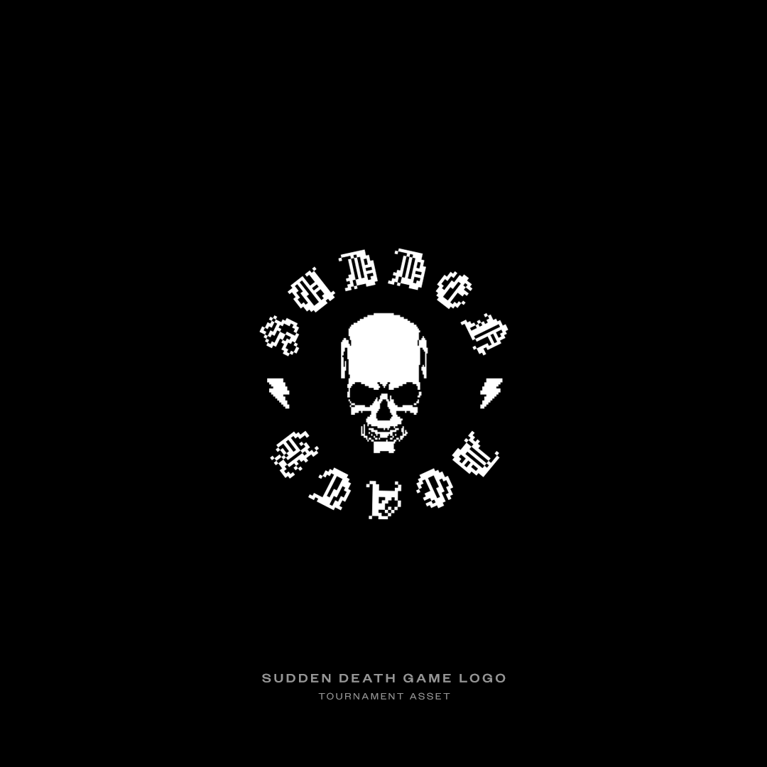
GRAPHICS
The graphics were definitely the most enjoyable part of this whole project, I had so much fun making all of the little logos and companies inside of this film’s world.
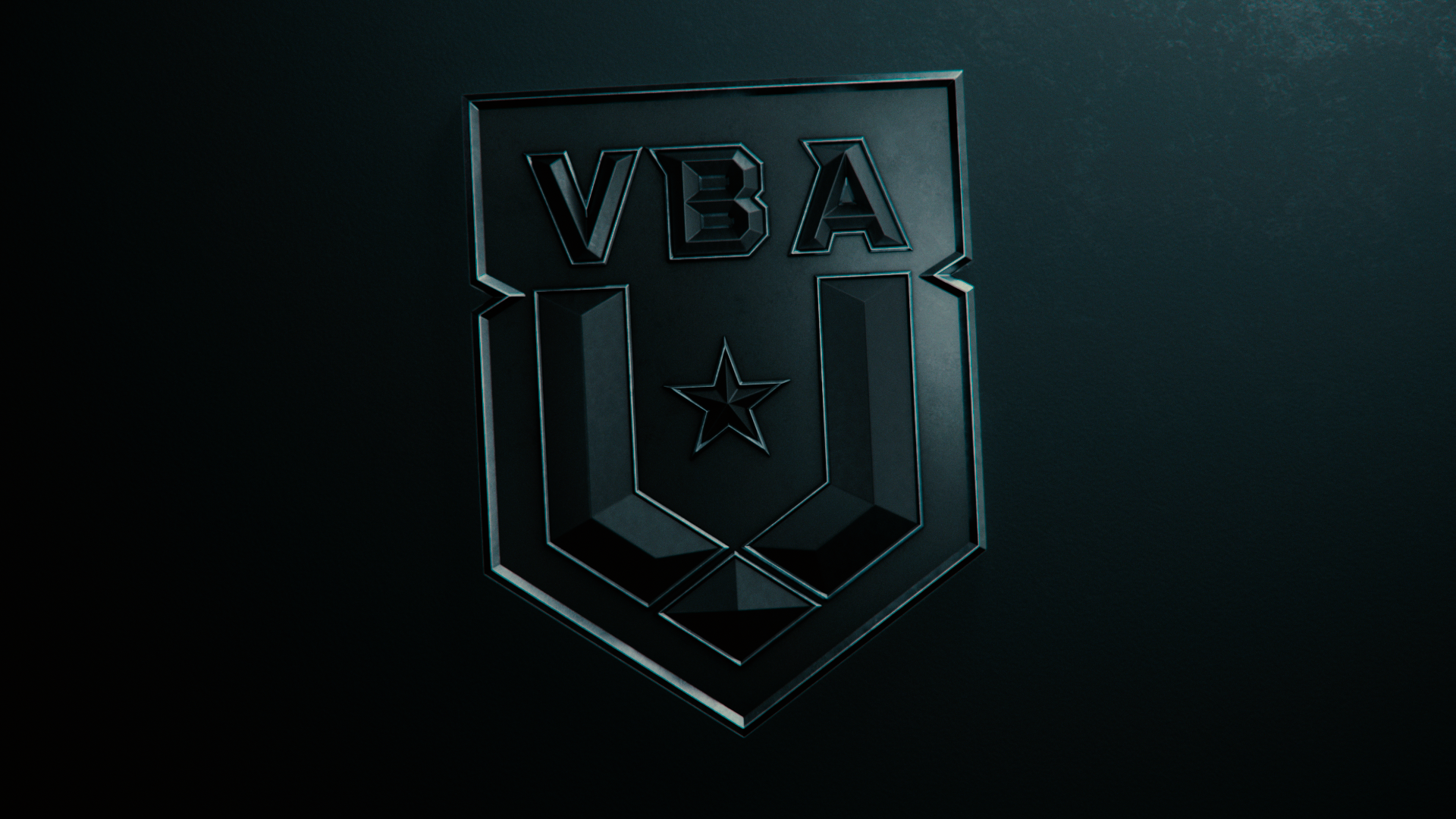
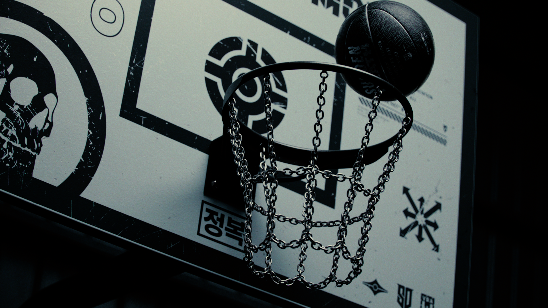
The first graphic I created was the VBA logo, it was finished right around the time I had my first rough animatic done. I wanted to have a face to the brand I was creating for so I could make more aesthetic decisions along the process of creating other graphics. I drew a lot of influences from airforce military badges for the VBA logo, I felt that flight and basketball held many similarities and represented a very strong brand.
I brought all the logos from Illustrator to Photoshop to fit in a square format so they could be applied in Redshift with ease. I made them black and white so they could be used as alpha mattes and displacement maps in Redshift to make my life easier.
The scratches we’re applied to the graphics in Redshift instead of Photoshop because it gave me more control in the lighting & texturing process. I could change the level of wear for a graphics to be more or less prominent in a couple clicks.
In 3D I always look for the workflow that will give me most control so I can make decisions faster in the creative process instead of wasting time switching between softwares.


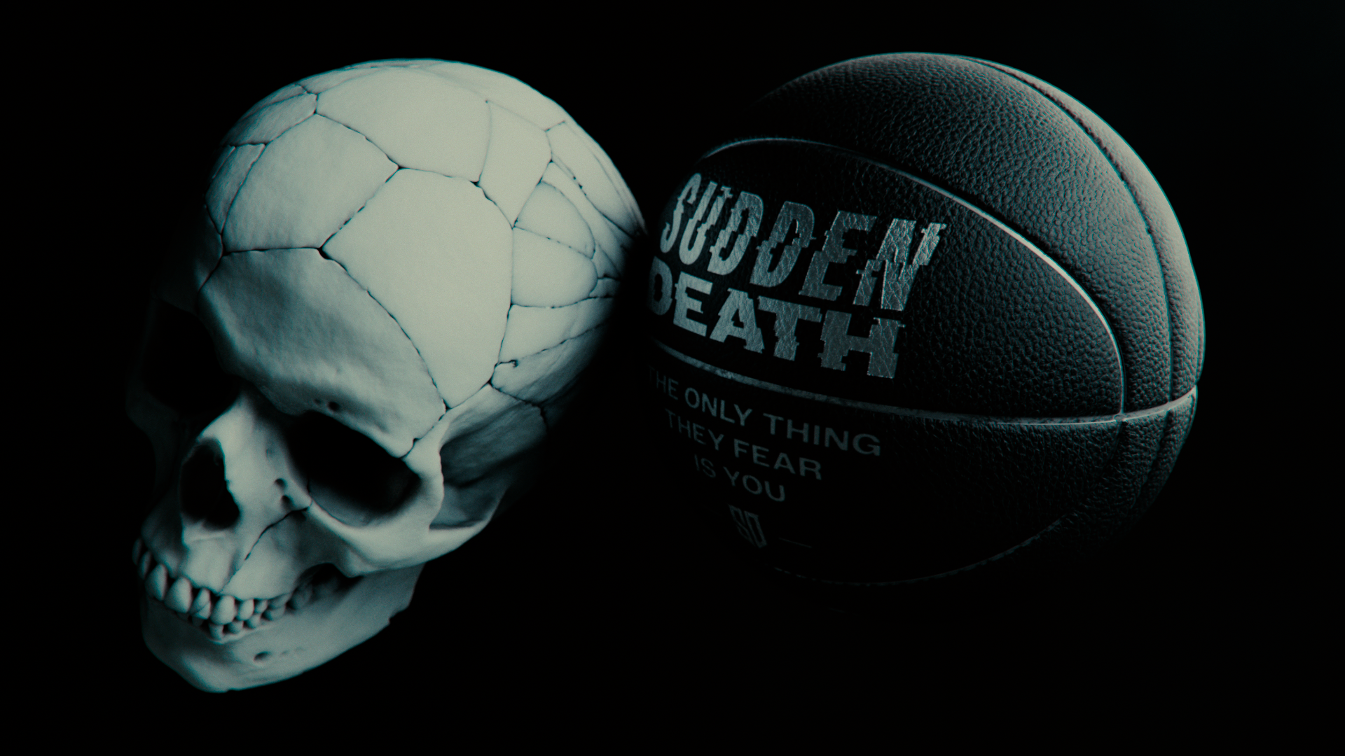
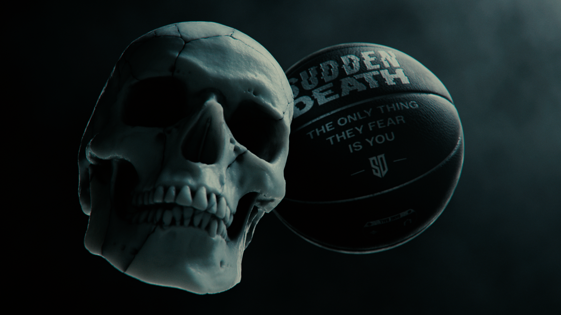
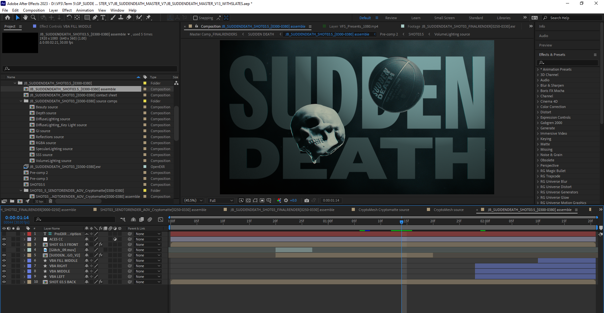
COMPOSITING
I love huge typography that is bold and really in your face, but it was also super important to me that the text didn’t just sit in front of the visuals. I wanted the typography to interact with the 3D elements and work together to feel more engaging than a simple text layer above everything else.
This is where cryptomattes came in; they gave me the ability to create mattes for my 3D objects in After Effects and place text layers of any other graphics behind the 3D elements. Before these I used to use puzzlemattes but I found that cryptomattes have way more control and are way easier to set up in Redshift.
Finally comes in the ACES workflow, my mentor Shawn Hight recommended that I try it out so I wanted to give it a shot. I did some research and found some great videos on how to set it up but it wasn’t the most straightforward process. But it gave me so much control!
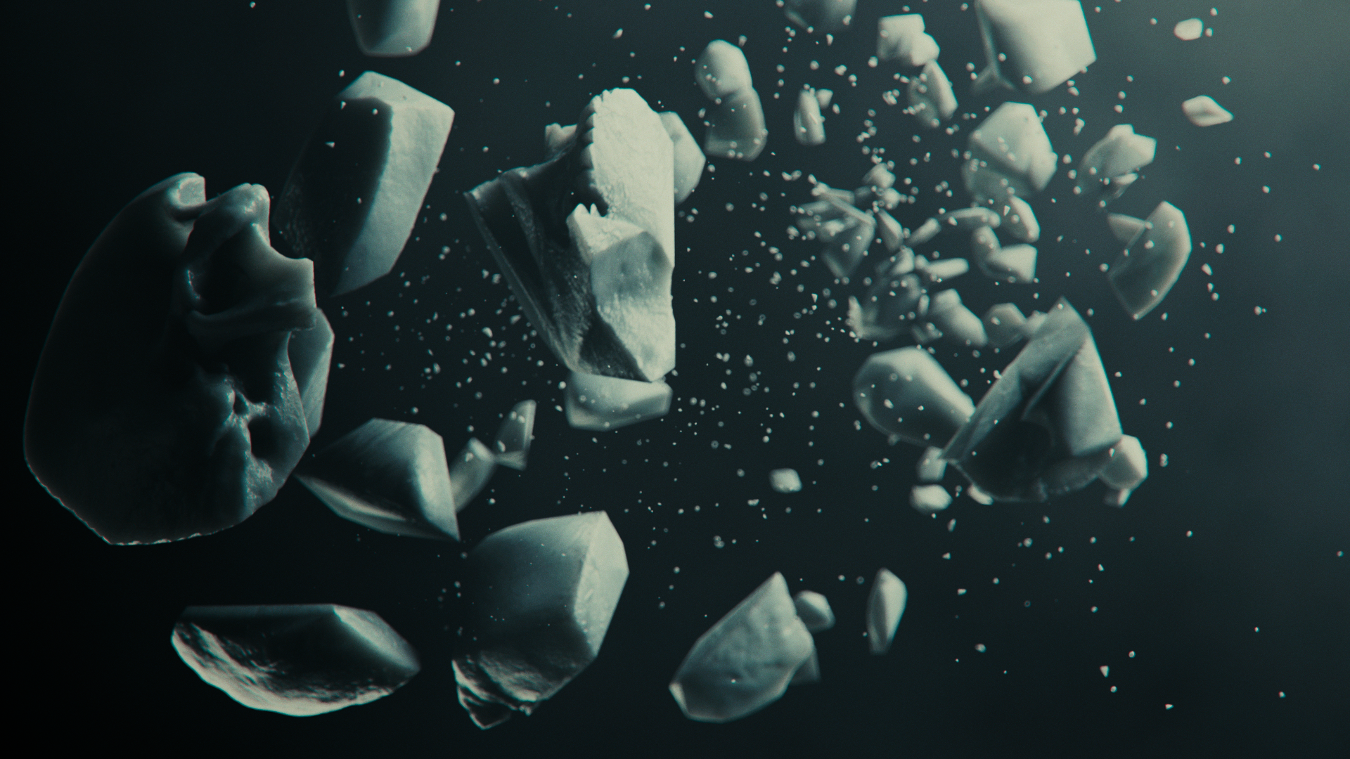
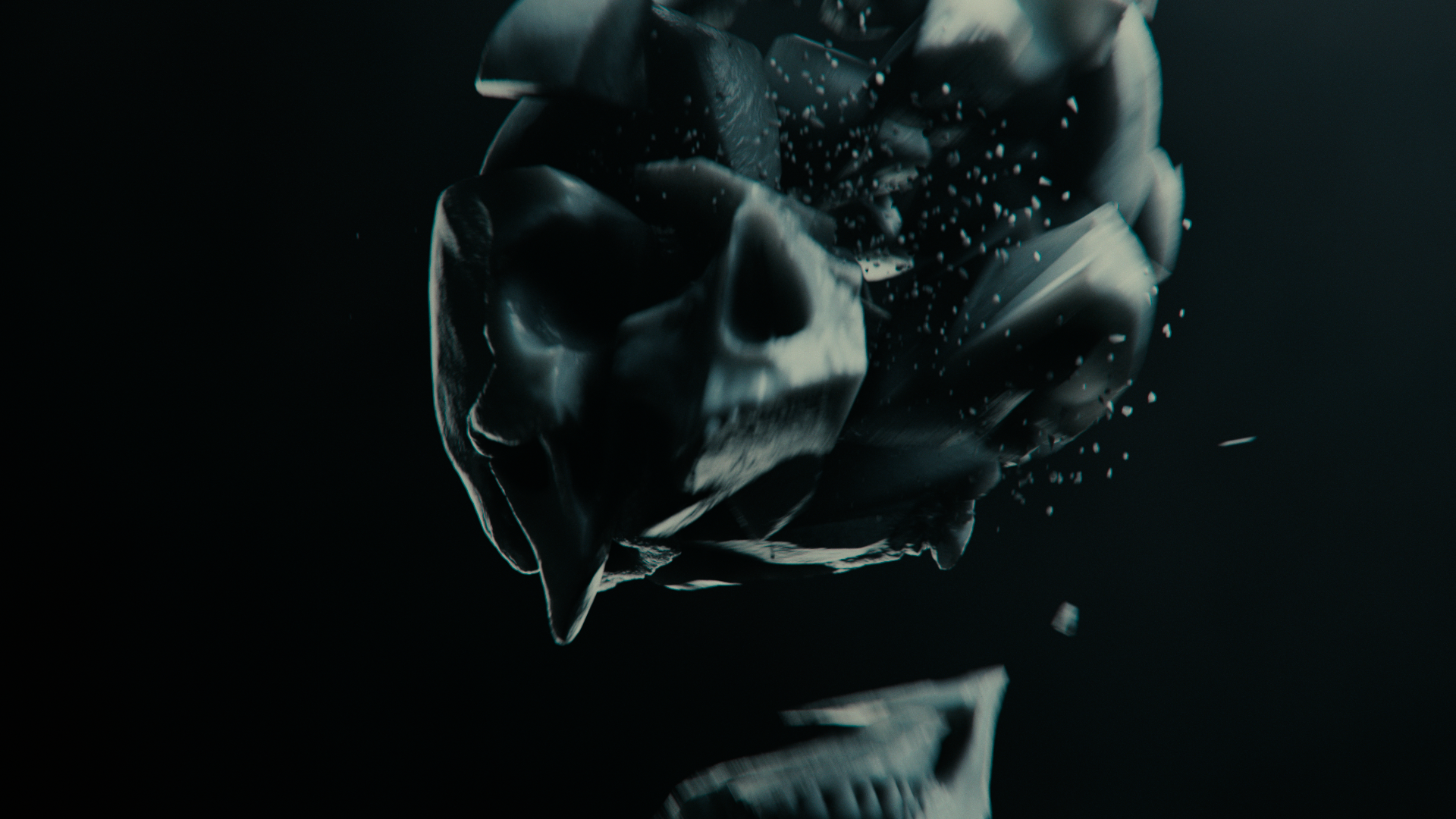
First of all I felt more confident because I knew my renders coming out of Redshift were the exact same as in After Effects. Also the dynamic range I could get out of images was great too, there we’re a couple scenarios where some scenes (especially the the skull) got blow out. And because I was working in ACES and I had AOVs setup I was able to contain the highlights without having to rerender.
This is where cryptomattes came in; they gave me the ability to create mattes for my 3D objects in After Effects and place text layers of any other graphics behind the 3D elements. Before these I used to use puzzlemattes but I found that cryptomattes have way more control and are way easier to set up in Redshift.
Finally comes in the ACES workflow, my mentor Shawn Hight recommended that I try it out so I wanted to give it a shot. I did some research and found some great videos on how to set it up but it wasn’t the most straightforward process. But it gave me so much control!
First of all I felt more confident because I knew my renders coming out of Redshift were the exact same as in After Effects. Also the dynamic range I could get out of images was great too, there we’re a couple scenarios where some scenes (especially the the skull) got blow out. And because I was working in ACES and I had AOVs setup I was able to contain the highlights without having to rerender.


© JONATHAN BRIOSCHI 2024